
BRANDING
LOGO

DESIGN PROCESS
At the heart of our studio is a commitment to clarity, intention, and innovation. We approach each project with a balance of strategy and creativity — beginning with deep discovery, then building concepts rooted in bold visual language. Whether we’re crafting a record sleeve or a full brand identity, we design for resonance — ensuring that every visual choice feels intuitive, elevated, and unmistakably fresh.
branding
Client
Sputnik
Year
2024
RD Design is a creative studio run by Riley Teague and Devin Ybarra whose work is primarily focused on music packaging and promotion, with an aim to create design experiences that feel visually and sonically in tune.
Outside of music, we also work with clients to create branding, advertising, marketing, and overall visual storytelling.

ABOUT
Typography
Primary
Hanno
Bold
ABCDEFGHIJKLMN
OPQRSTUVWXYZ
abcdefghijklmnopqrstuvwxyz
0123456789!@#$%^&*()
Years
1957, 2020


ARTIST OVERVIEW

Foundries
Monotype, Very Cool
DESIGN PROCESS
Our identity is built to be modern, sleek, and unapologetically forward. The sharp forms and minimalist layout aren’t just for show — they’re a reflection of how we think: precise, progressive, and stripped of excess. The visual language we created echoes the rhythm of contemporary culture — strong, clean, and confident.
White
#F6EDCC
DESIGN PROCESS
Our palette is intentionally restrained. By using contrast — black, white, and considered accent tones — we create breathing room for bold shapes and expressive design elements to stand out. The result is a system that feels grounded, but never static. Clean, but never sterile. Confident, and always evolving.
Colors
Black
#F6EDCC
Secondary
DESIGN PROCESS
Typography is at the core of our system. Our custom type work strikes a balance between functionality and expression, allowing words to act not just as vessels for information but as visual statements. It’s bold, geometric, and meticulously structured — a direct extension of our studio’s energy and voice.
Neue Haas Grotesk
ABCDEFGHIJKLMN
OPQRSTUVWXYZ
abcdefghijklmnopqrstuvwxyz
0123456789!@#$%^&*()z

PRINT + TYPOGRAPHY
Secondary


Tertiary


DESIGN PROCESS
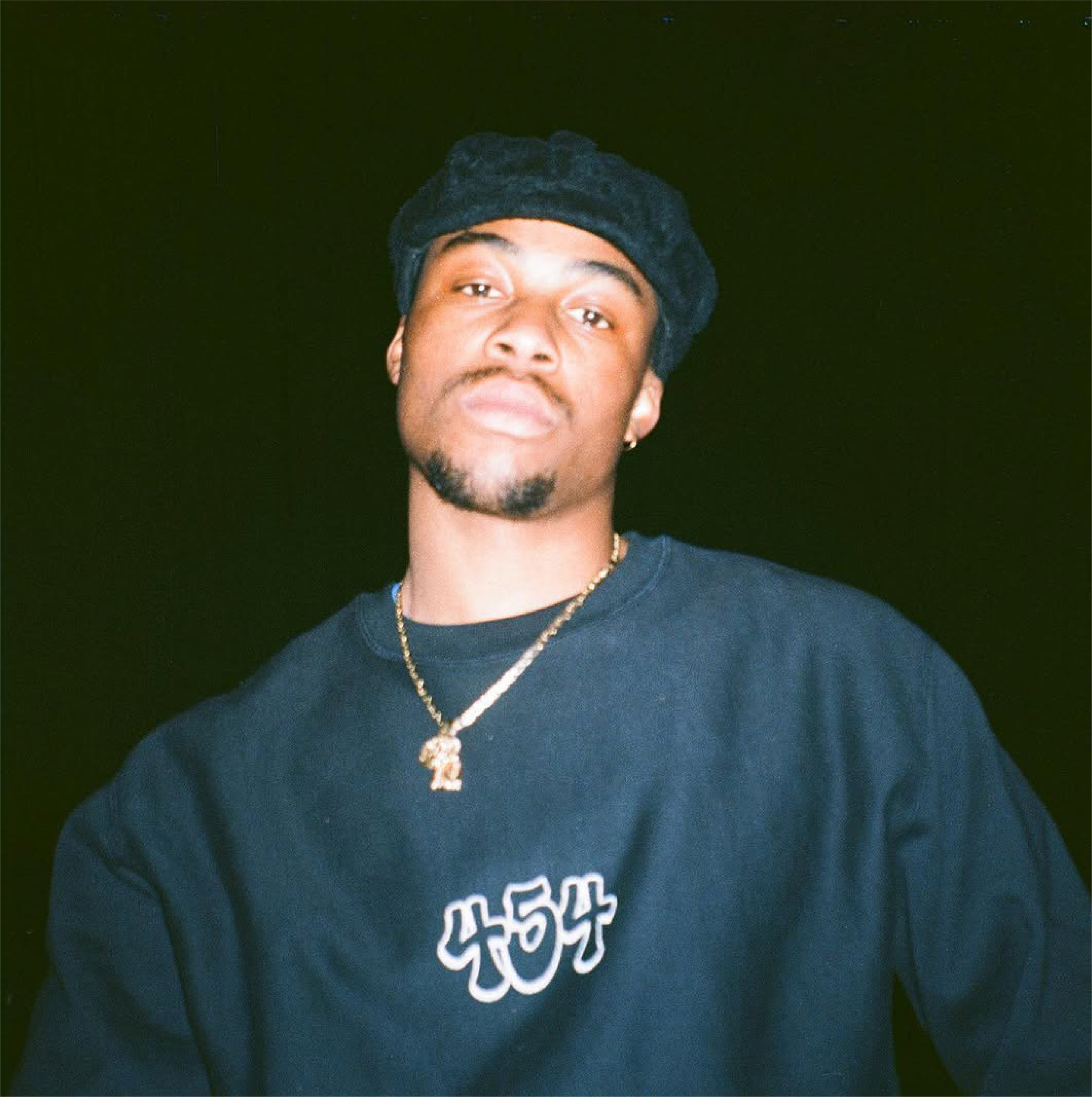
Understanding the ethereal and emotional feelings Willie evokes, we wanted to highlight the rawness captured through his lyrics, the colorful beats he raps on, and the abstraction of his voice through autotune.
Born Willie Wilson, The 24-year-old musician got his start making beats in Longwood, Florida. 454 matches his ethereal production with a flow that’s equally rooted in clouds of smoke and real emotion, modulating pitch and tempo to a hypnotic effect. His songs have a way of transporting the listener into a different state of mind.
ABOUT
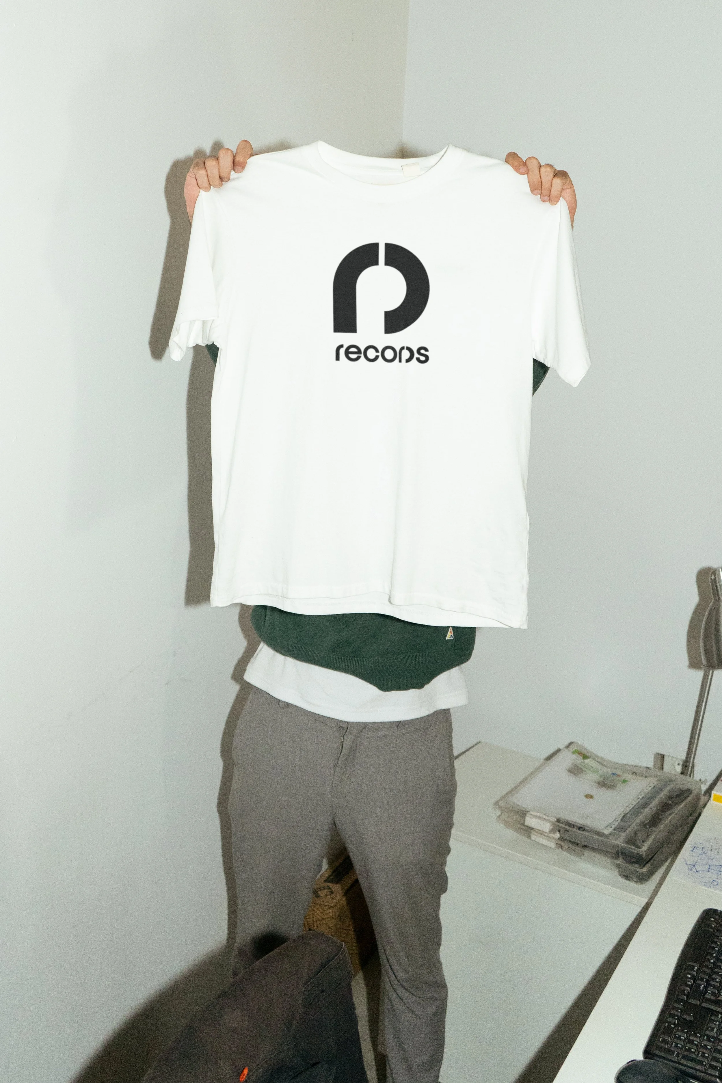
Print Visuals & Details
Yellow
#18264F
Red
#F6EDCC
White
#F6EDCC
Typography
Black
#F6EDCC
DESIGN PROCESS
We highlighted the color yellow to reflect the fun, vibrant energy of his beats — a visual translation of the brightness and boldness that defines his sound.
Colors
DESIGN PROCESS
tHROWS
OutliNe
ABCDEFGHIJKLMN
OPQRSTUVWXYZ
abcdefghijklmnopqrstuvwxyz
0123456789!@#$%^&*()
Neue Haas
Grotesk
ABCDEFGHIJKLMN
OPQRSTUVWXYZ
abcdefghijklmnopqrstuvwxyz
0123456789!@#$%^&*()
Primary
Spread
Secondary
454 Album Deliverables

Years
1957, 2020

Foundries
Monotype, Very Cool
We brought this vision to life by incorporating a graffiti-inspired typeface — a nod to the raw emotion he channels through his work, and a direct connection to the graffiti roots that influence both his visual style and photographic storytelling.

Front

Back

CD Cover
CD Jewel Case
Lyric Book/Insert


Vinyl Packaging
Front
Back
Vinyl
Sleeve Tracklist


Vinyl Insert

Vinyl Insert

Vinyl Open Spread
